Thursday, August 6, 2020

Tiny Tag Tins

 Hey all! Welcome back. Today I've got these cute little tags inspired by these wedding favor tins from Michaels. I thought they would be perfect for a little package but wasn't sure for what. I then went through my stash of stamps and found some really cute ones from Clearly Besotted. These ones are called "You're So Tweet." I went with a monochromatic feel for each tag again and I just loved how they blend into a beautiful rainbow. 

I added some flowers and sentiments from Paper Trey Ink and just stamped them with coordinating Altenew ink colors. I matted then onto scalloped square cardstock and added a photo mounting square on the back so they 

can be adhered to a scrapbook page or a gift. I found that even with the stamp dimensionals popping the tags up, they were still small enough to fit 8 in a tin. I added an extra tag on the top of the tin as a decoration and finished the tin off with some ribbon,


I created another one too, using these adorable owls from Clearly Besotted's "You're a Hoot".These ones struck me as more school like feel, so I used Cherry Cobbler, Old Olive and Crumb Cake colors from Stampin' Up! I cut some hearts and added them for a bit of embellishment, and finished them off with some cute red and white twine. I layered that on some scalloped circles and a retired background leaf stamp from Stampin' Up! to make it look almost like they were behind a tree. All told, these little tags measure about an inch and a half big. Perfect as card candy or gift tags. I got even more ideas so don't think I'm done with these yet! 

I hope you're inspired!
~Brandie~

Monday, July 20, 2020

Flowering Beauties

Hey all! Welcome back. It's been a minute but I'm back too! Today, I am excited to show you these gorgeous peek-a-boo card with acetate and featuring The Greeting Farm and Altenew. I had gotten these Greeting Farm Fairy Beans a while back and I used some spare whisper white paper that I was cutting on my scan and cut and added some 'beans' and just cut them out too. I had no idea what to do with them. I started by coloring them all monochromatic. I left them on my desk for about a week and just stared at them. I thought they were super cute. I added some Wink of Stella for a bit of glitter.
Ugh. I'm obsessed. They are so stinkin' cute! With something like this I knew I wanted to create a set of cards, and I also knew I wanted to make these be a focus without too much going on. I have no idea what the inspiration was, but I ALSO received my order of Altenew floral stamps and dies and I wondered if they would work with these images. I wasn't sure as the beans are cutesie and the florals were more realistic. I decided to go for it. I knew I wanted the beans to peek through the flowers almost like a fairy in a forest would. I thought it would be best to use acetate as a front page of the card, layer the flowers on that and have the beans on their on mini card inside.
I originally wanted to make the flowers look like a bunch with just the eyes peeking through.
It was bad. So bad my husband came up and said 'ya, don't do that."
I decided to put the flowers in the corners and create a modest frame on the ends, and it worked out so much better.

I used some old swirl stamp sets from Inkadinkado to create a color matching background. I really wanted to keep the card base simple so the design stood out.
I really wanted to post each card to showcase the monochromatic feel as well as the variety of florals for each of them. I finished each of the cards off with a bit of Recollections Glitter Paper in small strips and accented the card with those, and of course a bit of wink of stella. Each card has that acetate front where I adhered the florals on. The only thing was, I created blank die cuts of each of the flowers and leaves to glue on the other side of the acetate to hide the glue. Unfortunately, it did bulk the card up a bit. I don't know what I would do differently. I wound up pasting a lot of small pieces for each leaf and each flower but if there was a way to create an aesthetically pleasing shape to glue on the back and hide the adhesive instead, I would love to figure that out.
I also topped off each card with some small embellishments, either pearls or rhinestones and just dotted them around sporadically.
I especially loved doing these on the blue fairy and added a rhinestone on the center of her flower which disappears once you open that first layer up.
I started with the yellow fairy first, and grabbed my Crazy About You (retired) Stampin' Up! set. I was able to create sentiments that worked for simple thinking about you cards. The outside was purposely left without a sentiment to keep focus on the image.
None of the sentiments are specific so these really are all occasion cards. And I stamped the sentiments into an ink color just a shade darker than the swirls to keep with the monochromatic theme.


The front of the card opens up normally and then the smaller card inside, measures 4x2.75 and opens in the opposite direction like a joy-fold card.

Here's a quick peek of the green fairy to show you how the first layer opens up and creates this beautiful diorama type of image, and then the next photo shows just the fairy and how simple and elegant the tiny card is.

I know it's kind of a longer post, but I really wanted to show each of the cards and just how pretty they turned out. I really hope it inspired you and have yourself an amazing night!

~Brandie~


Thursday, June 25, 2020

Dysfunctional Space Family

Hey there! Welcome back :)
Father's Day came and went, but I hope everyone took the time to celebrate the awesome men in their lives. I am fortunate to have not only a loving husband and father to my own children, but a dad and step-dad in my life.
As it was stated before, we are a big family of nerds. Huge. My husband prides himself in 'neducating' (nerd-educating) our children. I am sure that's why he agreed to have kids in the first place, just to have someone to share his nerdiness with. I know I have given them shout outs before, but finding Kindred Stamps and their pop culture stamps, especially a certain space-themed movie that my husband is a huge fan of, was destiny.
Unfortunately, these guys from the "Galactic Adventures" sets are retired. I definitely get my use out of them with my family, and with my Scan n Cut I was able to stamp and cut and color a bunch out for these fun Father's Day shaker cards.
I started out with the characters and built the card around them. I did a basic A2 card base and cut a large frame out with some rectangle dies. I did a layer with the same rectangle window and then used some acetate and 3D adhesive strips from Stampin' Up! to create a shaker window. I wanted the window to be huge so I could have a fun, dynamic card front.
I wanted to create an inside that was showcased by the window but not over shadowing it. Kind of like one of those 3D glass layered paintings. The different elements by themselves are pretty, but together they are gorgeous. I used Tim Holtz distress oxide inks and blended them together for a galaxy feel. I then took some Frost White shimmer paint from Stampin' Up! and mixed it with water in a spritzer and sprayed over the blend. The cool thing was the water reacted to the ink, as it does, but then the shimmer paint added an extra element by creating some shimmer. Absolutely loved the effect. Then the card was finished off with the sentiments (printed with a Star Wars free font) and shimmer paper stars. The card has different layers with the star shakers, the characters, and then the galaxy background/inner card. I really love this card and it was perfect for any nerdy dads out there. I can't wait to use this technique with other ideas and occasions. I hope you are inspired!

~Brandie~

Monday, June 22, 2020

Peek A Boo!

Hello Everyone! Welcome Back. Today I am featuring these newer stamps sets from The Greeting Farm. There are a handful of designs, 3 little ladies (Anya) and 1 dapper dude (Ian). The neat thing about these sets is that they come with a couple of cute sentiments AND they have a back side to each character. If you haven't already,  I would recommend checking out their website. They not only have clear and rubber stamps- high quality and crisp images- but they have a new litany of digital images that you can create these fabulous scenes with. A lot are perfect for what's going on, from thanking essential workers to working from home. You can even see a tutorial on YouTube on how to create those scenes.
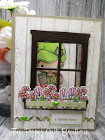
But I digress. I don't own them myself (yet) but I definitely had to get my hands on these lovely ladies for now. With all the social distancing in the past couple of months, I had the idea of these girls peeking through a window to say 'hi' because they miss you! I first tried the layout for Mother's Day to see how it would work. I loved the grey wood panels and I just love pink with grey. I started by stamping Smokey Slate ink on Smokey Slate cardstock with the Woodgrain stamp from Stampin' Up! I then cut a rectangle through the card base and woodgrain layer. I had this window die from a Stampin' Up! Christmas set (retired). It came with a floral window box that I thought would be great for this card. I cut 2 window frames out and added acetate on both. I put one on the inside of the card (to hide my rectangle) and added some 3D adhesive strips from Stampin' Up! to create a shaker with the window. Once the shaker was completed,  I used a variety of flowers and dies from different Greeting Farm and My Favorite Thing sets. Add some pop of color with pieces of DSP and embellishments and it finished the card front off nicely. Then you got your character on the inside peeking out. You could even make this a double page card so you have more room to write a sentiment. I loved the idea of this card so much that I used Crumb Cake and Blushing Bride and Granny Apple Green for the next one for a more mod color scheme. Then, instead of Mother's Day, did a thinking of you/miss you which would be great for someone you haven't been able to see during quarantine.
 
 I just love the hat on this girl! Plus her little coffee cup. Wouldn't she be perfect with a coffee gift card? I have so many more ideas in store for her. Now with my new toy (still giddy over the Scan n' Cut) I can avoid fussy cutting her and do the whole front/back thing like these stamps were intended.
The colored plaid paper for both cards is from various packs of My Favorite Things 6x6 packs. The epoxy hearts are from Recollections at Michaels. All coloring was with Copics and the sentiments were from the the retired Family Ties stamp set.

Hope I inspired you to create your own missing  you cards! Thanks for stopping by.

~Brandie~

Tuesday, June 16, 2020

Super Dad

Hey all! Welcome back.
Life is all blending in to itself, I swear. I work, same shift every day. Come home. Chris and the kids are home. Clean. Cook. Craft. Eyes blurring, head swimming. And the weather up here is all dull and wet and I am pretty much just exhausted. 
But then something comes along my desk and whether it's a story idea or card idea, the inspiration just invigorates me. That was the case with these fun fold cards. I got myself a scan and cut (LOVE IT LOVE IT LOVE IT!) and it's made my crafting life so much easier. Now, I haven't been much of a fussy cutter, so I just avoid it and work with stamping straight on my page. Just sucks cuz it limited what I could do and if I ever wanted to build a scene I had to do a lot of masking. But with my new toy, I was able to cut a bunch of images out and just color them- which was easier than I thought it would be.
I had pre-cut a bunch of images from Kindred Stamps for Father's day coming up. 
Unfortunately, all of these images are from sets that have since been discontinued. The heroes were from 2 separate limited edition boxed sets and then the space guys are from Galactic Adventures that have been sold out as well. I would highly recommend following Kindred Stamps for different pop culture icon stamp sets. They are beyond incredible. I have missed out on a few and have kicked myself.
Anyways, I digress. I had cut and colored a bunch of images out for Father's day cuz, well, the father of my children is a big nerd (and I love him for it). I figured he's not the only big nerd in the world, so I should prepare myself.
After cutting and coloring I was left with....now what? I had a few go-to's that were popular last year (stay tuned!) but I also like doing different things and challenge myself. I found on Pinterest something called a W-fold. I thought it would be fun to create something that looked very comic-esque and wound up coming up with these.

I was able to cut out the letters from my Scan and Cut. I need to work on my measurements a little bit better, I wanted to do a shadow effect. It's not perfect close up, but it does the job. I found some Super Hero paper from Recollections and downloaded a free font from 1001fonts.com called Crimefighter. It's not cheesy like comic sans and works really well for that Comic look. Then at the bottom I stamped and embossed the cityscape background from the retired You're Super set from My Favorite Things.
Then you open this simple front of the card and BAM! - we have the W-fold into a lovely comic themed 3D layout.
I also used the same font and sized it so it would fit the POW die cut that matched the You're Super set. I cased the idea that has been all over Pinterest for Father's Day gift ideas and just wrapped it up into a card form.
Here's a few different angles for you to see just how fun this card is.

Well that's it for me tonight. I hope you've enjoyed. Thanks for stopping by!

~Brandie~


Tuesday, June 9, 2020

Floating Florals

Hey guys! I'm back after a month's hiatus. I really didn't mean to be gone that long, but sometimes you need a social media break, especially with everything going on in the world today. That and getting accustomed to a new 'normal' with the kids not being in school, husband being laid off, and focusing on crafting crafting crafting (and occasionally writing).
That being said, I hope to combine the two now that I have so many items to showcase.
I found this wonderful technique from the amazingly talented Jennifer McGuire. Her tutorial can be found here: https://www.jennifermcguireink.com/2018/12/floating-die-cut-frames.html
and though I don't know her personally, or professionally, I have followed her awhile now and I completely blame her for my new obsession with the company Altenew (and most others I haven't heard of and now need ALL their products!)
So not only did I get myself these Totally Tropical stamp and die sets, but I just had to CASE this technique for myself.
The awesome thing about this technique is that, though it can be a bit tedious, you can make a bunch of cards at once, and with the floating technique, you can also do an outer frame and inner piece and get 2 cards for one.
The stamp set is a layered set and I used different color families for each flower. I found this part the most tedious, each floral had at least 3 layers and I did a bunch at once to make a lot of cards. I believe this netted me 5 frames which, in turn, became 10 cards. To stamp that many flowers, especially when they are layers, it's best to have a stamping tool. I have a Stamperatus from Stampin' Up! and I know a lot of people use and swear by Misti.  If you don't have one of these tools, I would highly recommend that being your next purchase. It was so easy to line up each layer and just stamp, rotate the page, stamp, rotate. Then you line up the next layer and stamp, rotate ect. Then going ahead and cutting each piece out with my Big Shot. Again, for ease you could always scan and cut if you have one of those machines. When it comes to stamps with dies, I really like doing it the old fashioned way myself. So long as I don't have to fussy cut!
Now that we are done with the most time consuming part, we head into the more intricate part. Using a 4.25 x 5.5 base (or smaller if you wanted to layer it- mine are 3.75x5), you then take the pieces that you've cut out, cover the entire base with out overlapping any of the pieces. This is where it gets fun, and tricky.
You'll need a kitchen item- Glad Press and Seal NOT cling wrap, but the press and seal (its important). Press a piece of Press and Seal over your piece/base combo, carefully so as to not shift the pieces too much. Press all over and hard enough so you are sticking it to the pieces and the base. Then trim the overage (the Press and seal and all the pieces that hang over the edge of the base). I like to press the Press and Seal against the pieces again to make sure they are good and stuck, then peel the base away and set it aside. I keep my pieces/Press and Seal upside down and set it on my Big Shot. I then use a basic shaped die (I used the rectangle from the Geo Frames set from Altenew) and just cut through the pieces and the press and seal. You'll carefully peel the die away and gently place the 2 separate pieces down- you'll have a 'frame' and a 'center'. Then using some 3D adhesive (I like stampin dimensionals) place a bunch down on every single piece, but leave the gaps empty to achieve that floating illusion. I find I am not very good at lining up the frame with the base, so I don't bother turning the frame over, but I place the base along the frame while it's still upside down so as not to shift or screw it up (I've done that before). Then when the frame piece is adhered to the base piece, flip it back over and peel away your press and seal. VOILA! you now have a floating frame!
Another technique I learned was to cut a bunch of layers of a sentiment (like the YOU here from Crazy About You from Stampin' Up!- now retired). I cut 4 or 5 of them out, used a glue pen to glue them all together and then they were about the same height as the frame. Add some Stickles and Wink of Stella and you're done! The solid frame above was just framed with some cardstock layers and then used the THANKS sentiment from that same stamp and die set.
The color combination is Mango Melody, Melon Mambo and Bermuda Bay- all available from Stampin' Up!
Make sure to swing by and check out their NEW in colors- now available for the 2020-2022 season.

Thanks so much for stopping by, hope you were inspired!

~Brandie~

Thursday, April 30, 2020

Welcome Home

Hey everyone. Hope you're all well. For all my card crafty followers I hope that you are taking some time to craft and be creative. If not, that's okay. Do what you need to for yourself. For me, I need to be creative to be sane. It lets me pour it all out into something. But then, I too have days where I have zero inspiration and want to do nothing. It's all about balance and every day is a new normal we all have to find for ourselves. It's sure not easy, but I really do hope you all manage.

Speaking of normal, people still are out doing things- even differently. I have a friend who's parents are moving so she commissioned me to make a housewarming card. I saw a few different ones on Pinterest that followed this layout.

I loved how the die cut houses peeked over the window. I used the retired Hearts Come Home dies from Stampin' Up and cut the few houses I wanted. I created a window from a label die I had and sandwiched a couple of acetate sheets between the top layer and base layer to create a shaker for the window. I trimmed the hearts come home stamp from the set and took off the 'Christmas' at the end of the sentiment- and it worked! I added some die cut hearts and the Hello sentiment from the Hello You set from Stampin' Up!

Here you can see the fun sequins I added in red and black and then some gold stars from a glitter combo pack I got from Michaels. Finish it off with some paper elements and some twine and voila- done!
To create the window I had my card base and layer lightly adhered and put them through my die machine at the same time. I then added the acetate to the back of the front, and the front of the card base- cutting the acetate about a quarter of an inch smaller. Then I put some Stampin' Up! 3D adhesive strips around the the window on the card base so I could line up the top layer and the bottom layer after I put the filler in.

That's it for me tonight, I hope you're all inspired!
~Brandie~

Monday, April 20, 2020

Video Game Brothers

Hey all! Happy Spring :)
It has been beautiful weather the past couple of days and the snow is FINALLY melting. The bad news is flooding though, all my walk paths are huge puddles. But spring is finally here and I am so happy. Despite the pandemic still in the world, I am able to go for walks and enjoy the weather. It isn't easy to look on the bright side or to see blessings when there is so much negativity, but for myself, those small things can help me look to a brighter future.
These cards are a couple months old. I whipped them up for my son's Valentine's day cards (which was the last week he had of school).
They came together pretty quickly once I had an idea. I love making my own invites/Valentine's/any holiday cards and favors for the kids at school. Matt was my 'surprise' baby so he came after the older 3 by a few years. My 'stay at home mommy' phase was focused on the older three when they were  younger and I would do every holiday all out. Poor Matt got the short of the stick there. Store bought (GASP!) cards weren't unheard of while I balanced work and mom life. As I mentioned before, I am now working at an amazing place that not only feeds me mentally and doesn't wear me down like previous jobs, but I can afford to be part time which gives me more time to focus on my crafting.
But still, need to find something that is quick and simple when I need to bust out 16 or more for a class room ;)
These are all single layer cards matted on a scalloped base. I didn't add any embellishments or do any fussy cutting or die cutting so the most time consuming thing was doing the image coloring, and then doing the masking so I could create the video games scenes. These are "Video Game Brothers" from the amazing Kindred Stamps. I adore their pop culture stamps that everyone just knows to see and the fans just go nuts over. The inking was done with Tim Holtz distress inks and My Favorite Things background stencils. And the thing is, these would work for any sort of occasion to let someone know you love them and are thinking about them. Which, in this day and age, would be greatly appreciated.

Hope you all are inspired!

~Brandie~
Thursday, April 16, 2020

Pretty Puppies

Hey all!
Like I was saying yesterday, I am in love with Spring colors and florals. I do like winter, but only around Christmas. I deal with it in January and then we get, what we Northerners affectionately call 'false spring' in Feburary followed by 'second' (and sometimes third or fourth) winter. This happens in March and April. It's not uncommon to have snow on May Long. Definitely not uncommon to have snow during Easter.
I am officially over it. Though I am born and bred here in Grande Prairie, Alberta, and I don't see myself ever leaving (home IS home after all), I am still over it.
So I boycott our prolonged winter with bright colors, fun stamp sets, 'summer' food (cooked indoors lol), and wearing capris and letting my legs get a bit chilly.
So when I pulled out my bunny stamps from Whimsy, I found my Naughty Puppies set from them as well and couldn't resist creating some fun, spring time cards.
I decided I would start doing a Sketch Challenge and color combo challenge to keep my designs fresh and help when I am a bit stumped on a design. I love doing different fun fold and interactive cards, they are big hits with my customers, but when you have a beautiful image as a focal point, sometimes it's nice for it to be just that; the focal point.
Here's the sketch that I found on Pinterest:
I used Bermuda Bay, Mango Melody and Smokey Slate as my palette. The designer series paper were from some stacks I had gifted to me so I am unsure of the names of them. I found as close as I could to the Stampin' Up! ink colors. The Sentiments are from Gina K Designs For the Grad wreath builder stamp set. And I was a bit addicted to creating my own mini blooms with some various flower builder dies from Spellbinders. I inked the flowers with Distress Oxide Ink from Tim Holtz-  Ripe Persimmon and Broken China. Love the bold color combo and how they light up the card. I had a lot of fun using a sketch challenge and it made creating this card a lot easier. Look for more sketch and color challenges in the future.

Please feel free to follow me at crafterseden on Instagram to see what I am working on next!

~Brandie~

Wednesday, April 15, 2020

Easter Blessings

Hey everyone.
With Covid going on it was easy for me to have time fly by and not realize what day it is. I have been working, so I am aware of dates but Easter crawled up on me. I had plans to really expand my business this year and to do spring shows with Easter items, Mother's and Father's Day and weddings and grad. It seems with the way the world is right now, everything has been cancelled. It hasn't really, but sometimes it was easy for me to get in a funk and think 'Why Bother?'
But I should bother. We should all bother. In a safe way we should be bothering. So I got out of my funk and am working on the rest of the upcoming spring holidays and going digital. I will miss doing the outdoor markets at my local Farmers Market this spring and I'll miss the face to face with people, but I can still make beautiful things and inspire and make people's day.
I still did some Easter items - we are FINALLY melting the winter snow up here in Northern Alberta so I really wanted to do some fun, spring floral patterns and colors.
These images are from Whimsy Stamps. They are absolutely adorable. I really like how detailed they are and own quite the collection. These bunnies are perfect for Easter!
After coloring in the images, I really wanted to use that bold teal and fuchsia so I used Stampin' Up!'s Bermuda Bay and Berry Burst to stamp some florals from their Sale a Bration Thoughtful Blooms stamp set. I matched that with more bold colors- Highland Heather and Mango Melody on a Crumb Cake stamped Woodgrain background. I love how the colors pop and just scream Spring.

The next little bunny was completed yesterday, so after Easter came and went. I just did it as a simple thinking of you card. I framed the image on a glittery piece of cardstock cut in a cut out scalloped circle. I based it on a die cut piece of Whisper White that I cut out using Floral Phrases thinlits from Stampin' Up! I layered it on a piece of vellum and finished it off with some sheer ribbon. Very simple, and yet very pretty.


Carrying on with the Easter theme, I brought back the idea of lollipop cards. I like calling them ''picks" or "piqs" because they would be perfect as a little 'pick' in a bouquet or peeking out from a gift bag. I used the same images from Whimy Stamps: The Bunny in a basket is: Bonnie and the Bunny on a branch is: Springtime. I used Stampin' Up!'s retired Floral Frames framelit dies for the base. I mounted the images on slightly larger circles cut out from glitter cardstock and finished them off with some sentiments printed off my computer on Whisper White Cardstock. Add some wonderful sheer and thin ribbon from Michaels, handmade flowers from Spellbinders floral dies and attach on paper straws and you're done!
I don't know about you, but the bursts of colors and florals is enough to bring me out of the dumps and hope for a future soon where we could all get back to normal.

Until then, stay safe and healthy and inspired.

~Brandie~

Thursday, March 26, 2020

Starlit Babies

Hey all,
Anyone see that Facebook meme going around- something about how they thought they would give the house a nice deep clean (or any other big project they were wanting to) if given the time, then self isolation proved that that was a lie?
Ya. That's me with crafting :D I was going to get soooo many cards and projects made.
Well, my kids are all older (save my 10 year old) so I don't have them under foot, but goodness did I ever over estimate my abilities. I haven't written nearly as much as I planned, didn't make as many projects as planned either- let alone deep clean anything or finish any of my books I got from the library before I self quarantined for a couple of weeks.
But let me tell you, I have mastered the art of mid afternoon naps, all the bad snacks and binge watching competition shows on Amazon Prime. Oh yea. I'm a master :D
On the non-lazy side, I have done a bit of business studying to improve my home based business and hanging out with my kids more. We've been doing a lot of board games and I've been getting my butt handed to me at Dominoes.
I did happen to get some stock done up. I was low on baby cards so I used these adorable images from the stamp set Look for Stars by Craftin' Desert Divas.
 With the first card here, I wanted it to be gender neutral and so that means soft yellows for me. I LOVED this star stencil that came with the now-retired Justice is Served Boxed set from Kindred Stamps. I used that and Mustard Seed Distress Oxide ink by Tim Holtz to create the star bursts in the background. I also used the Slider Surprise dies from My Favorite Things Stamps and instead of doing a traditional pop up card, I moved the layout horizontally. Add some glitter with wink of stella, stickles and glitter cardstock and we are good to go. The sentiments are also from MFT Stamps- Welcome, Baby. I did trim some of those sentiments down so I can use them in a more versatile way, which is great. MFT Stamps are photopolymer and easy to trim down without damaging the images. Each card today uses the same sentiments from Welcome, Baby and images from Look for Stars.
This second card was inspired by a card I saw on Pinterest called Fun Fold Card. I used some MFT Stamps Blueprints Dies to create the window and then some Lawn Fawn Stitched Clouds. The stars were from a Recollections punch and a star from a random die set (I believe it was one of the MFT Stamps tag sets). I love how it opened up and created this dimensional effect. The one thing I disliked, and you have to look really close, is that I inked the stars with distress ink and added some wink of stella, but for some reason it made some yellow smudges on the clouds.
Then the inner 'card' opens on the right instead of the left and has room for a sentiment and personal message.
Lastly,  (and actually the first baby card I made out of these sets), I have a different Fun Fold Card. I loved the colors- Daffodil Delight and Bermuda Bay from Stampin' Up! It's not a super light baby pallet that we are used to, and I think that's why I enjoy it. I also mucked up one of these cards by NOT knowing how to use my Wink of Stella and I gooped a bunch of the glitter paint on the moon. So I needed to cover it up because I made it WORSE by drawing over the lines of the image of the moon with a black pen to hide the extra glitter. It did not work. So extra stars. I loved how they peek through and I also love that in paper crafting. Any mistake can be re-worked and no one is the wiser. The circles used were from inverted scallop die from Crafting Desert Divas. Now, I've mentioned before that they are no longer in business, but there are other companies that do inverted scallops- and I believe Lawn Fawn has sets. Again with the fun fold you have that dimension and then the image and then the inner card for a sentiment.

Well that is it for me, for now. Back to creating. That and binge watching ;) I hope this inspires you all while in social distancing/isolation mode. Please stay healthy and safe!

~Brandie~

Saturday, March 21, 2020

Just a Little Card Making

Hey all! Welcome back :)
Around Christmas time three? four? years ago, I had purchased Stampin' Up!'s Mini Pizza Boxes and 3x3 Envelopes. I love unique packaging and I couldn't wait to do something with these items. I started using them as mini Christmas card/tag sets. They were so successful that I tried my hand at making different varieties for all occasions. Pairing the idea with the ever-so-awesome Kindred Stamps pop culture stamps was a match made in heaven. The images are easily recognizable and due to their size, these cards are best left simple, which is why these stamps sets are perfect for them. I've done a few with floral images (as seen in a previous post), but I would recommend using just that one main image and not getting too carried away with embellishments or additional images. These are also great because you can add them to a gift as a tag, gift the boxed sets as a gift themselves (they fit 5 mini cards perfectly), or just give the card itself as a little note. I wouldn't recommend mailing a single card as they are pretty small, though. And if you leave the sentiment open and the inside blank, you can use these for practically any occasion.
The images used today are from the Toy Box limited edition box set from Kindred Stamp (retired), and on the princesses, it's from a variety of 5 different sets: Little Town Life, I'm Wishing, Arabian Nights, Once Upon a Nap and Rags to Riches. All are still available from Kindred Stamps and each set is full of vivid, beautiful images to create a simple card to an elaborate scrapbook page or decor.
I hope you're all inspired.
Thanks for stopping by.

~Brandie~


Tuesday, March 17, 2020

Mythological Creatures

Hey all! Welcome back to my blog. It's me, Brandie quarantined up in the frozen north. Wherever you are, I do hope that you are safe and healthy. I won't sugar coat it, it's pretty scary out there right now. It's not even the virus itself that is scaring me. It's the unknown factors. My children are home from school and I am home from work. It's affecting the economy and people are scared to leave their houses. And though it's 'only' a flu, it's a pretty serious one that can wreak havoc on someone immune compromised- and let's face it- whether it be a newborn niece, elderly grandfather or just a neighbor or a friend, we have someone on our list that is at a higher risk. I know it seems like over kill and I worry about the lasting effects on the world as a whole, but as a believer in Christ, all I can do is hold tight to my faith and trust God that everything will work out for our good (Romans 8:28)
I hope whatever your personal beliefs are, you are safe and take time to mentally separate from the barrage of news on social media.
As for me, I have taken a few days off of crafting, as I've been busy at work (closed, but still a lot of behind the scenes things to get done), trying my hand at homeschooling my 16, 14 and 10 year old (God help us all lol), maintaining my 19 year old's sanity as she's out of work and crafting and writing.
I have to admit, I am a bit worried about my little home based business. It's always been more of a hobby business, but I was eager to get started and really make strides this year, but it looks like God's got other plans. My husband said if nothing else, just focus on creating stock. So that's what I am planning going forward.
Now as I've said, I haven't created anything new in a few days, so these are older cards from my stock. The images are from Craftin' Desert Divas and, unfortunately, the company has closed it's doors. It did sadden me as the artistry is adorable and very versatile. I had recently found them prior to the close and imagine my nerdy excitement when I found they had different mythological characters. The images themselves are not the focus of this post, however. I tried using a few different mediums on these cards and would like to highlight those.
All images came from the same retired set, Forest Friends. I colored all the images with my Faber Castells instead of my traditional copics. I find that with copics, you can get a crisper high and low light so they seem to jump off the page and give greater dimension, but with the Faber Castells it gives a softer look, are easier to get a crisp blend and makes it look more story-book, which is what I was wanting to go for. I knew I (as always) wanted to create my own background. However, beyond the basic trees and clouds I was unsure how to do that. I wanted to create sand and sea and a rock for the mermaid. Unfortunately, being as I couldn't find any 5.5 envelopes in my area, I had to trim the bottoms off of my cards to make them A1 size. I still had the glitter frame that I wanted, but you won't be able to see much detail in the Ent and Dryad here. I had inked some 'grass' using my distress inks and then flicked a few grass strands with my copics. I then added a bit of texture paste. What I did was mix some of Ranger Texture Paste with Ranger Alcohol ink and a bit of Martha Stewart Glitter. I dabbed it over the inked areas so it had some texture and glitter to match the border. Once I trimmed the excess of the card off though, it got rid of all that work. I had already assembled the border so I couldn't trim any more sky to fit more grass, if that makes sense. I really enjoyed using my Woodgrain embossing folder from Stampin' Up and creating 'bark' to frame the image at least. 
 The same thing happened with the Nymph and the Satyr here on the 2nd card. I will do these again, and maybe ditch the frame and focus on the textured background. I do enjoy the coloring from the pencil crayons though. Flesh tones were a bit tricky to get right, but a little practice paid off. The flowers in the above card are from a couple of EK Success punches, and the stamped and cut flowers are from Paper Trey Ink. All sentiments are from various Gina K Designs sets.
 Finally on the last card you get to see the texture paste shine. First I used my cloud stencil and instead of the typical blue, I used pinks and yellows to hopefully convey a sunrise or sunset. I die cut some Spellbinders leaves that looked a little like seaweed out of vellum I inked with the Alcohol Ink. I found shell epoxy stickers from Michaels and wanted to use those on here. Then to layout the image, I had to have the centaur positioned a bit higher than the mermaid. I first spread some texture paste tinted with a hint of blue and tried to swirl it to look like water. Being as I already stamped the images, I had to work carefully to work around them and not mess up the image. The water was fairly easy, but I wanted it to blend like soft waves on the sand, which was texture paste died with the alcohol ink and then added some golden glitter. The rock was a bit harder, I used a touch of grey so it stood out as 'rock' and tried to texture it to also look like rock. I used my stylus to mold the texture around the mermaids rear so it looked like she was sitting on it. I was okay cutting away part of the clouds, but I admit. All the cards do look like the abruptly end. Now that I've ironed out the kinks, I'll have to try again. As they say, practice makes perfect. And being home, it looks like I'll have more time to practice.

Again, for those who do come and read, I implore you to stay safe and be kind. Thanks for stopping by.

~Brandie~

Friday, March 13, 2020

All Shook Up

Hey there, welcome back!
Today I have got quite the classic beauty. These images come courtesy of "Golden Age" by Kindred Stamps. I have a custom request for a birthday card, and I happen to know the recipient. She enjoys old movies and musicals and everything else and he Golden Age of movies (and television... and music...) I saw a beautiful card on Kindred Stamp's website courtesy of Dina Kowal. She has a tutorial for her card on how she did a 'spotlight'. It was perfect for these golden age cuties. 
Now that I had the image completed, I really wanted a card to highlight it. I had gone through a few different card layouts and I knew I wanted something 3D to make the image pop. I couldn't really find anything, but I also knew I wanted to do a gate-fold type of card as I wanted the card to open like doors into a theater. 
After playing around with some scrap card-stock (anyone else do that? grab some card-stock that they think is a bit uglier and use it for playing around? Just me? okay then). The base of the card is a standard gate-fold, 8.5x5.5 scored at 2 and 1/8 on both sides. I tried playing around with and insert piece that was cut in the center as a frame. I first tried what people have done for those beautiful spinner cards, but being as this is gate-fold, that wasn't going to work. So I fiddled around for a bit. I then settled on this insert. I would make it a bit smaller next time so I could use a whole 8.5x11 sheet instead of 2. The inside is 5.25x9 and scored at 1, 2.5, 6.5 and 8. (the 1 inch score on both sides, I would trim down to .5 inches. They aren't needing to be that big. They are just pieces tucked under and adhered to the card base to allow the pop up to pop up). Now, I am unsure if cutting it smaller will work as I haven't played with the dimensions yet, so for this card it's the 9x5.25 piece.  
In between the center scores of the pop up, I trimmed a .5 inch border.
You could use a large die so long as the border isn't too small. I think the .5 inch border was a bit thin as when I closed the card the first time, it bent the border as it wasn't strong enough. I wound up cutting smaller pieces and adhering them to the back of the frame to stabilize it.
Being as I was going for a theater look on this card, I wanted to create a pulled curtain look. I found some old DSP in my stash (can't remember the company or even if it's paper I purchased or was gifted to me). I liked the Damask-ish look of the red paper. It was very old-theater-curtain style. I used my retired Stampin' Up! Top Note die and cut it in half to make it look like pulled back curtains. The 'rope' was from the tassel die from Stampin' Up!'s Celebrate Today (retired) set. I cut some pieces of Daffodil Delight and some copics to add highlights. The banner is a die from that same Celebrate Today set. The sentiments are from My Favorite Things Handwritten Happiness stamp set and embossed in gold. 
Lastly I wrapped a belly band around it with the same DSP. Using a die from the Eastern Beauty set from Stampin' Up!, I cut it in Whisper White and colored it in with copics and gold Stickles. Then to tie it all together I added a golden yellow tassel I made myself from some cross stick thread. 
I did add a birthday sentiment on the back so a person can write a personal message. Being as the card is thick, and not being mailed out, I used one of Stampin' Up!'s acetate box cards. They make great envelopes for thicker cards. Unsure how they'd mail or what the postage would be, but for personal giving it works just perfectly. I could decorate the envelope as well, and I think I just might.

Anyways, that's it for me tonight. I hope you enjoyed.

~Brandie~

Tuesday, March 10, 2020

St. Patty's Day Lollipop Cards

Hello all! and Welcome Back.
Today I have some beautiful images courtesy of The Greeting Farm "Hatters Kit". It is now retired but sometimes they bring them back for specialty purchase. I enjoy this set a lot and have used them for a variety of projects. Now I don't celebrate St. Patrick's Day myself, but it is fun with the green colors and I thought that this set would be perfect for them.
I had colored these images a couple of years ago and they were just sitting in my stash waiting for inspiration.
Well, thank you Pinterest.
I found something called Lollipop cards. I think they are beautiful and simple and perfect for tucking into a gift bag or a bouquet of flowers. Now, the ones I've seen used rosettes, but for these I used scalloped circles from Sizzix. They layer nicely with the circle dies I have. I layered my image, glitter paper and then the scalloped circles. I needed to use a 2nd scalloped circle to base the card over a stick of some sort. I used Whisper White so a person could stamp or write a sentiment on the backside. For the stick, I found paper straws to be colorful and the perfect height and weight. Party City had small packs reasonably priced in a variety of colors so I purchased a few different colors. The lime green ones were perfect for these St. Patty's day ones.
Finish the card off with some flowers, leaves and flowing ribbon and they are complete. I won't lie, I am a bit obsessed with these right now and I can't wait to make some Easter ones in the upcoming weeks.
And I finally used the images I had colored years ago! Win/win.
Well I hope you are all inspired. Thanks for stopping by.
~Brandie~


Sunday, March 1, 2020

Catch Those Cards

Hey all! As I mentioned a few days ago, when I don't have a stamp set that works for a specific project, I find a coloring page and print it on white card stock. Whisper White works best for my toner printer. The black stays pretty much put and it works great for coloring with my copics. Though I think if I were going to do these again, I would use my Faber Castels pencil crayons (colored pencils for any US fans).
For today's cards I had a custom request, a birthday card idea AND some birthday invites all involving Pokemon. First thing, I definitely needed to do these as telescope cards. Having the top layer look like a Poke-ball and open up to reveal one of the creatures and then any sentiments was just genius to me. I used some layering circles from Spellbinders, which layered these perfectly to close up and look like a little Poke-ball. For the 2 cards that were going to customers, I used a bit of Crystal Effects on the center of the Poke-ball so it looked plastic. I was going to do that to the entire ball, but it did not work well. Big mess. A hint was all it needed.
The one card was for a new baby. Apparently the parents are huge Pokemon fans and nicknamed each baby with a Pokemon name instead of calling the baby 'it'. I guess they called the baby Mew so it was requested that this card hold a Mew. I added a bit of various 'sparkles' stamped images from different sets and then added some Stickles and Nuvo Drops.
I could have used a regular envelope, but I really wanted to have the card stand out. So I used my We R Memory Keepers Envelope Punch Board for a 5x5 envelope. I cut a circle in the center and added a bit of acetate for a window. Before I added the acetate, I created a grassy background, kind of like where you would find a Poke-ball!
The next one is for a friend who is a huge fan. I don't know her favorite Pokemon, but I THINK it's Eevee. I really enjoyed coloring this one and thought it came out really cute. I added an extra page for signatures as this is going to the work place where we can all sign it.
For the next batch, I just wanted them simple as they are invitations for my son who wanted a Pokemon themed party. It's actually where I started to get the idea for Poke-ball telescope cards. He wanted a mixed batch of the basic starter ones, so we've got a few Charmanders, two Bulbasaurs, 2 Pikachus and 2 Squirtles.
I used my My Favorite Things background stencils to make the clouds and grass for the invites and make it look like the little guys were standing outside. I had also downloaded a free Pokemon Font from Font Meme. It brought everything together. I loved setting the Pokemon on a black background to make it pop.
 I didn't bother with special envelopes for these as they were just going to a bunch of 4th graders. They were still a huge hit!
Well I hope you got inspired to think outside of the box again, especially if you have an idea and may not have the perfect stamp set. Just make sure it's a generic coloring page from one of their sites and not someone's personal artwork unless you have permission to use it.
 Pikachu was from: coloringtop.com
Bulbasaur was from: freepokemoncoloringpages.blogspot.com
Charmander was from: supercoloring.com
Squirtle was from: bigactivities.com
Eevee was from: naturecoloringpages.com
Mew was from: clipart.email

I hope you enjoyed!

~Brandie~